There’s a piece of folk political science (attributed to Bill Clinton’s campaign manager) that says the only thing that matters in electoral politics is the state of the economy. Forget about leadership, ideology, manifestos containing a doorstep-friendly “retail offer”; what solely matters, in this view, is whether people feel that their own financial position is going in the right direction. Given the chaos of British electoral politics at the moment, it’s worth taking a look at the data to test this notion. What can the economic figures tell us about the current state of UK politics?
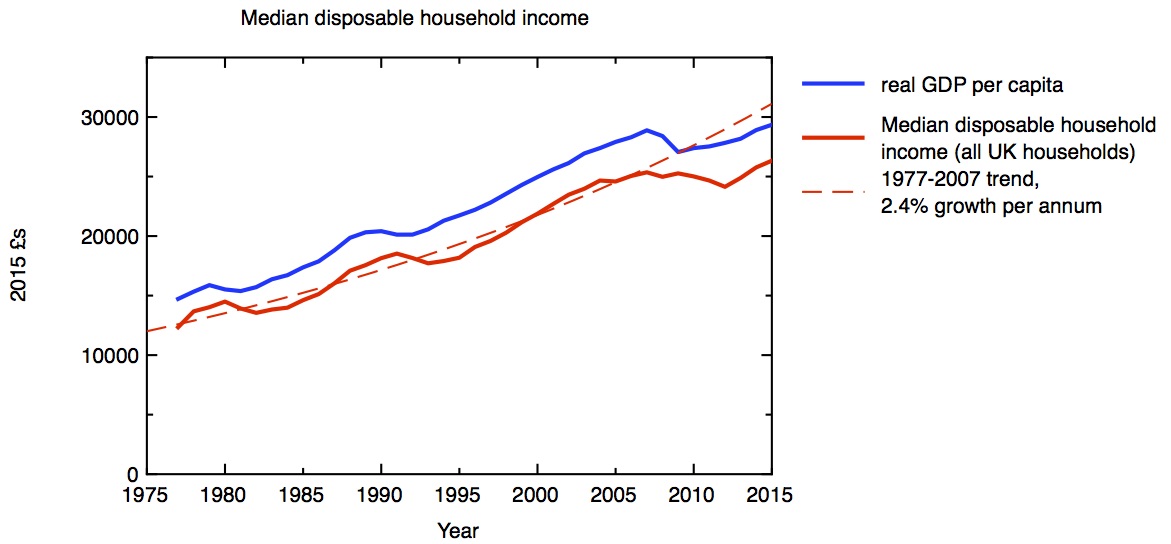
Median household disposable income in 2015 £s, compared to real GDP per capita. ONS: Household disposable income and inequality Jan 2017 release
How well off do people feel? The best measure of this is the disposable household income – that’s income and benefits, less taxes. My first plot shows how real terms median disposable household income has varied over the last 30 years or so. Up to 2007, the trend is for steady growth of 2.4% a year; around this trend we have occasional recessions, during which household income first falls, and then recovers to the trend line and overshoots a little. The recovery from the recession following the 2007 financial crisis has been slower than either of the previous two recessions, and as a result household incomes are still a long way below getting back to the trend line. Whereas the median household a decade ago had got used to continually rising disposable income, in the last decade it’s seen barely any change. To relate what happens to the individual household to the economy at large, I plot the real gross domestic product per head on the same graph. The two curves mirror each other closely, with a small time-lag between changes to GDP and changes to household incomes. Broadly speaking, the stagnation we’re seeing in the economy as a whole (when expressed on a per capita basis) directly translates into slow or no growth in people’s individual disposable incomes.
Of course, not everybody is the median household. There are important issues about how income inequality is changing with time. Median household incomes vary strongly across the country too, from the prosperity of London and the Southeast to the much lower median incomes in the de-industrialised regions and the rural peripheries. Here I just want to discuss one source of difference – between retired households and non-retired households. This is illustrated in my second plot. In general, retired households are less exposed to recessions than non-retired households, but the divergence in income growth rate between retired and non-retired households since the financial crisis is striking. This makes less surprising the observation that, in recent elections, it is age rather than class that provides the most fundamental political dividing line.
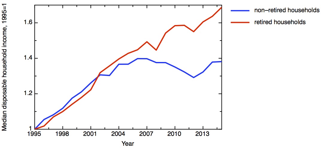
Growth in median disposable income for retired and non-retired households, plotted as a ratio with 1995 median values: £12901 for retired and £20618 for non-retired. ONS: Household disposable income and inequality Jan 2017 release
What underlies the growing narrative that the public is tiring of austerity, as measured by the quality of public services people encounter day to day? The fiscal position of the government is measured by the difference between the money in takes in in taxes and the money it spends on public services – the difference between the two is the deficit. My next plot shows government receipts and expenditure since 1989. Receipts (various types of tax and national insurance) fairly closely mirror GDP, falling in recessions and rising in economic booms. For all the theatre of the Budget, changes in the tax system make rather marginal differences to this. Over this period tax receipts average about 0.35 times the total GDP. Meanwhile expenditure increases in recessions, leading to deficits.
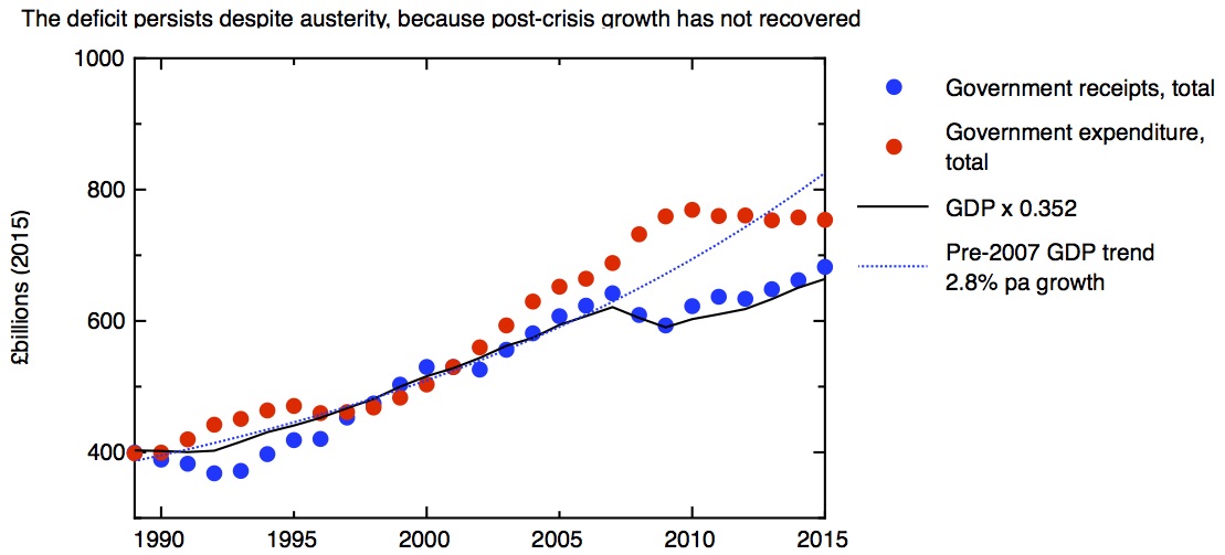
Total government expenditure, and total government receipts, in 2015 £s. For comparison, real GDP multiplied by 0.352, which gives the best fit in a linear regression of GDP to government receipts over the period. Data: OBR Historical Official Forecasts database.
The plot clearly shows the introduction of “austerity” after 2010, in the shape of a real fall in government expenditure. But in contrast to the previous recession, five years of austerity still hasn’t closed the gap between income and expenditure, and the deficit persistently remains. The reason for this is obvious from the plot – tax receipts, tracking GDP closely, haven’t grown enough to close the gap. Austerity has not succeeded in eliminating the deficit, because economic growth still hasn’t recovered from the financial crisis. If the economy had returned to the pre-crisis trend by 2015, then the deficit would have turned to surplus, and austerity would not be needed.
How do we measure economic growth? My next plot shows three important measures. The measure of total activity in the economy is given by GDP – Gross Domestic Product. This measure is the right one for the government to worry about when it is concerned whether overall government debt is sustainable – as my third plot shows, this is the measure of economic growth that the total tax take most closely tracks. It is certainly the government’s favourite measure when it is talking up how strong the UK economy is. But what is more important for the individual voter is the GDP per person. Obviously a bigger GDP doesn’t help an individual if has to be shared out among a bigger population, so it’s not surprising that household income tracks GDP per capita more closely than total GDP. As the plot shows, growth in GDP per capita has been significantly lower than total GDP, the difference being due to the growth in the country’s population due to net inward migration.
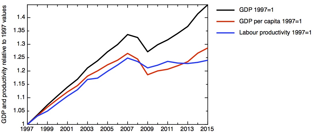
Growth in real GDP, real GDP per capita, and labour productivity: ratio to 1997 value. Data: Bank of England: A millennium of macroeconomic data v 3
Perhaps the most important quanitity derived from the GDP is labour productivity, simply defined as the GDP divided by the total number of hours worked. This evens out fluctuations due to business cycle, which affect the rates of employment, unemployment and underemployment.
Growth in productivity – the amount of value created by a fixed amount of labour – reflects a combination of how much capital is invested (in new machines, for example) with improvements in technology, broadly defined, and organisation. Increasing productivity is the only sustainable source of increasing economic growth. So it is the near-flatlining of productivity since the financial crisis which underlies so many of our economic woes.
It’s important to recognise that GDP isn’t a fundamental property of nature, it’s a construct which contains many assumptions. There’s no better place to start to get to grips with this than in the book GDP: a brief but affectionate history, by my distinguished colleague on the Industrial Strategy Commission, Diane Coyle. Here I’ll mention three particular issues.
The first is the question of what types of activity count as a market activity. If you care for your aging parent yourself, that’s hard and valuable work, but it doesn’t count in the GDP figures because money doesn’t change hands. But if the caring is done by someone else, in a care home, that now counts in GDP. On the other hand, if you use a piece of open source software rather than a paid-for package, that has the effect of reducing GDP – the unpaid efforts of the open source community who made the software may make a huge contribution to the economy but they don’t show up in GDP. Clearly, social and economic changes have the potential to move the “production boundary” in either direction. The second question is more technical, but particularly important in understanding the UK in recent years. This is how the GDP statistics treat financial services and housing. Just because the GDP numbers appear in an authoritative spreadsheet, one shouldn’t make the mistake of believing that they are unquestionable or that they won’t be subject to revision.
This is even more true when one considers the way that we compare the value of economic activity at different times. Obviously money changes in value over time due to inflation. My graphs attempt to account for inflation through simple numerical factors. In the case of household income, inflation was corrected for using CPI-H – the Consumer Prices Index (including housing costs). This is produced by comparing the price of a “typical” basket of goods and services over time. For the GDP and productivity figures, the correction is made through the “GDP deflator”, which attempts to map the changing prices of everything in the economy. The issue is that, at a time of technological and social change, relative values of different goods change. Most obviously, Moore’s law has led to computers get much more powerful at a given price; even more problematically entirely new products, like smart phones, appear. If these effects are important on the scale of the whole economy, as Diane has recently argued, this could account for some of the measured slow-down in GDP and productivity growth.
But politics is driven by people’s perceptions; if many people think that the economy has stopped working for them in recent years, the statistics bear that out. The UK’s economy at the moment is not strong, contrary to the assertions of some politicians and commentators. A sustained period of weak growth has translated into stagnant living standards and great difficulties in getting the government’s finances back into balance, despite sustained austerity.
We now need to confront this economic weakness, accept that some of our assumptions about how the economy works have been proved wrong, and develop some new thinking about how to change this. That’s what the Industrial Strategy Commission is trying to do.